Konträr
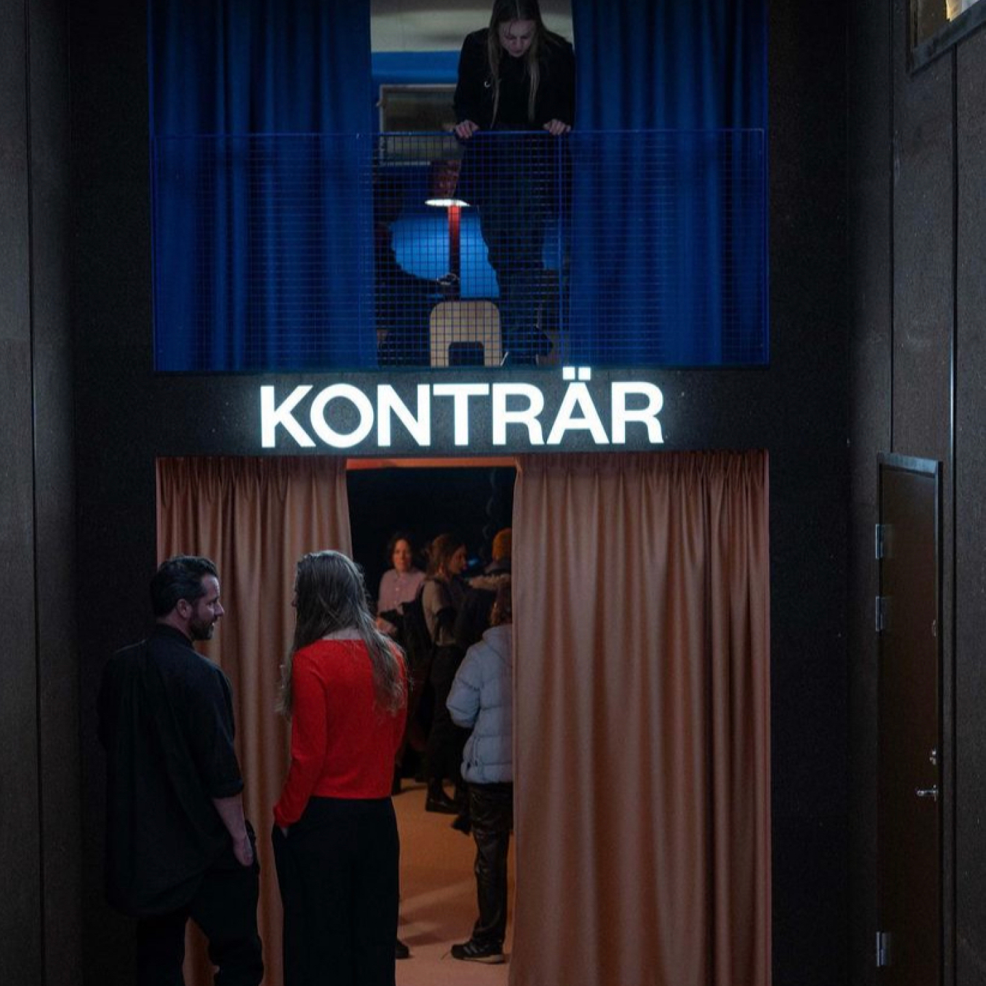
Konträr, meaning ‘polar opposite’, is a contemporary theatre located in the heart of Södermalm, Stockholm. They perform original pieces, collaborations and concerts from around the globe. We were tasked to create a visual identity that would help bring new energy into Stockholm’s culture scene.
Client
Potato Potato
Project type
Brand design, UI/UX
Partner
Credits
Tula Studios – Web developers
Navet Stockholm – Interior design
Skyltgruppen – Sign production
Martin Brusewitz – Photography
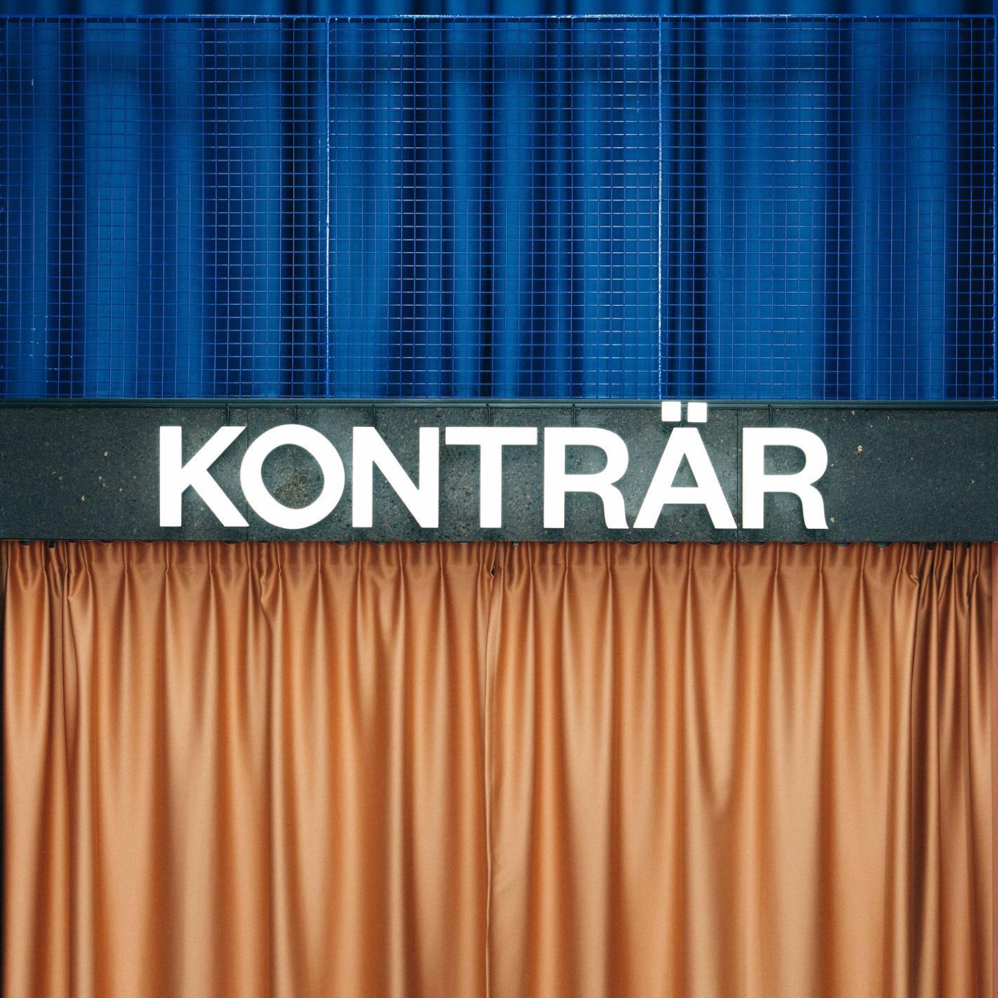
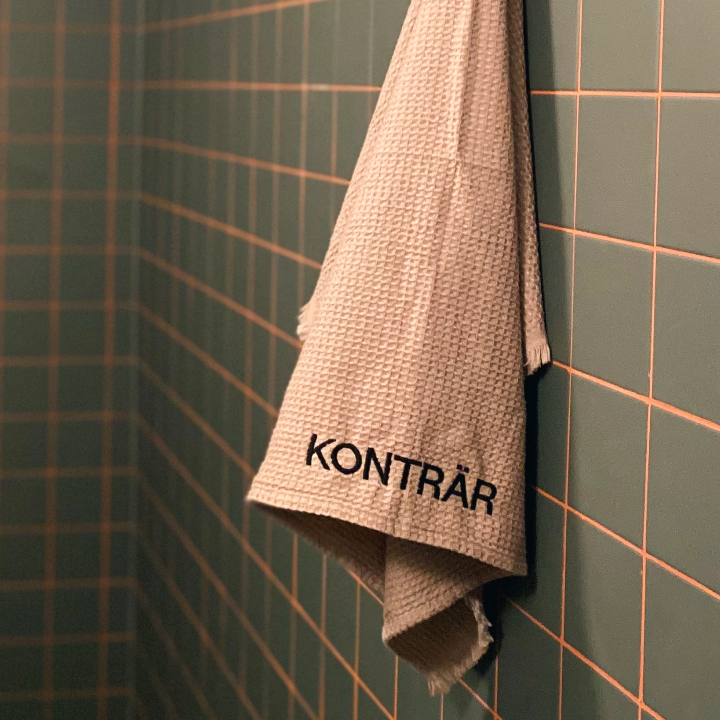
Design of a wordmark using a minimal font, tilting the “O” to give a hint of something being optically off without over telling it.
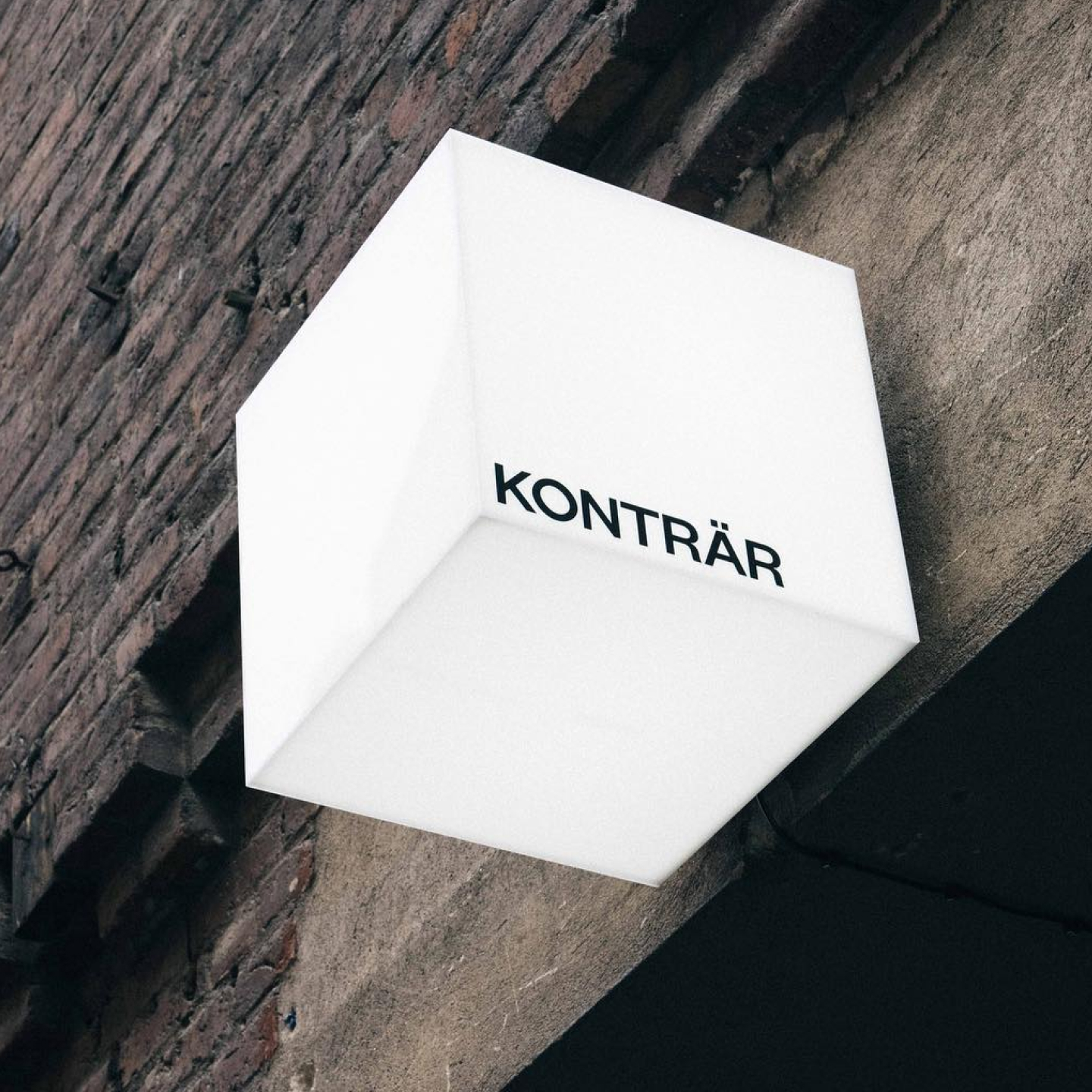
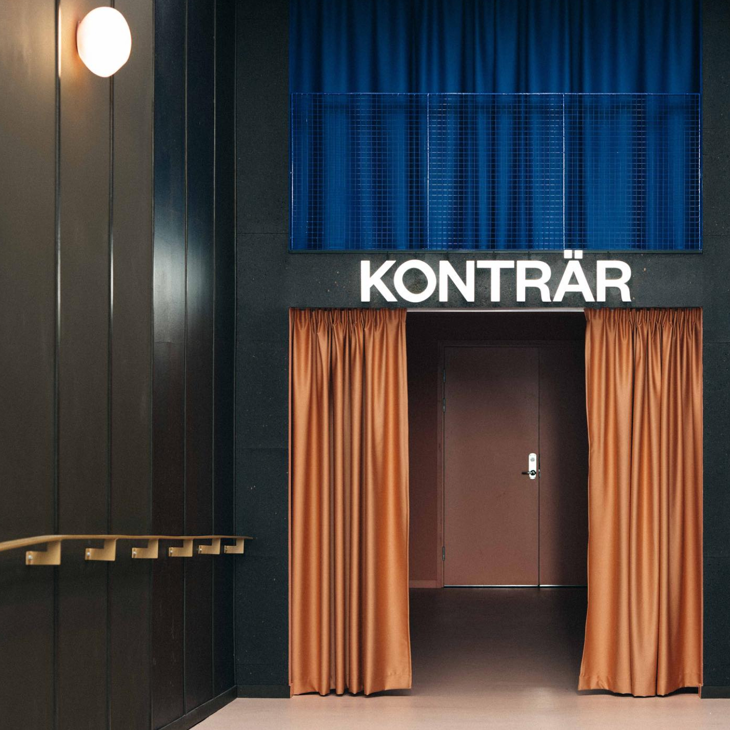
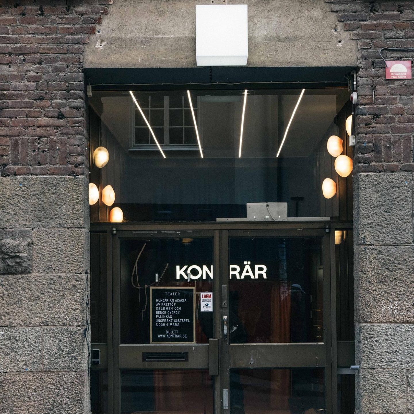
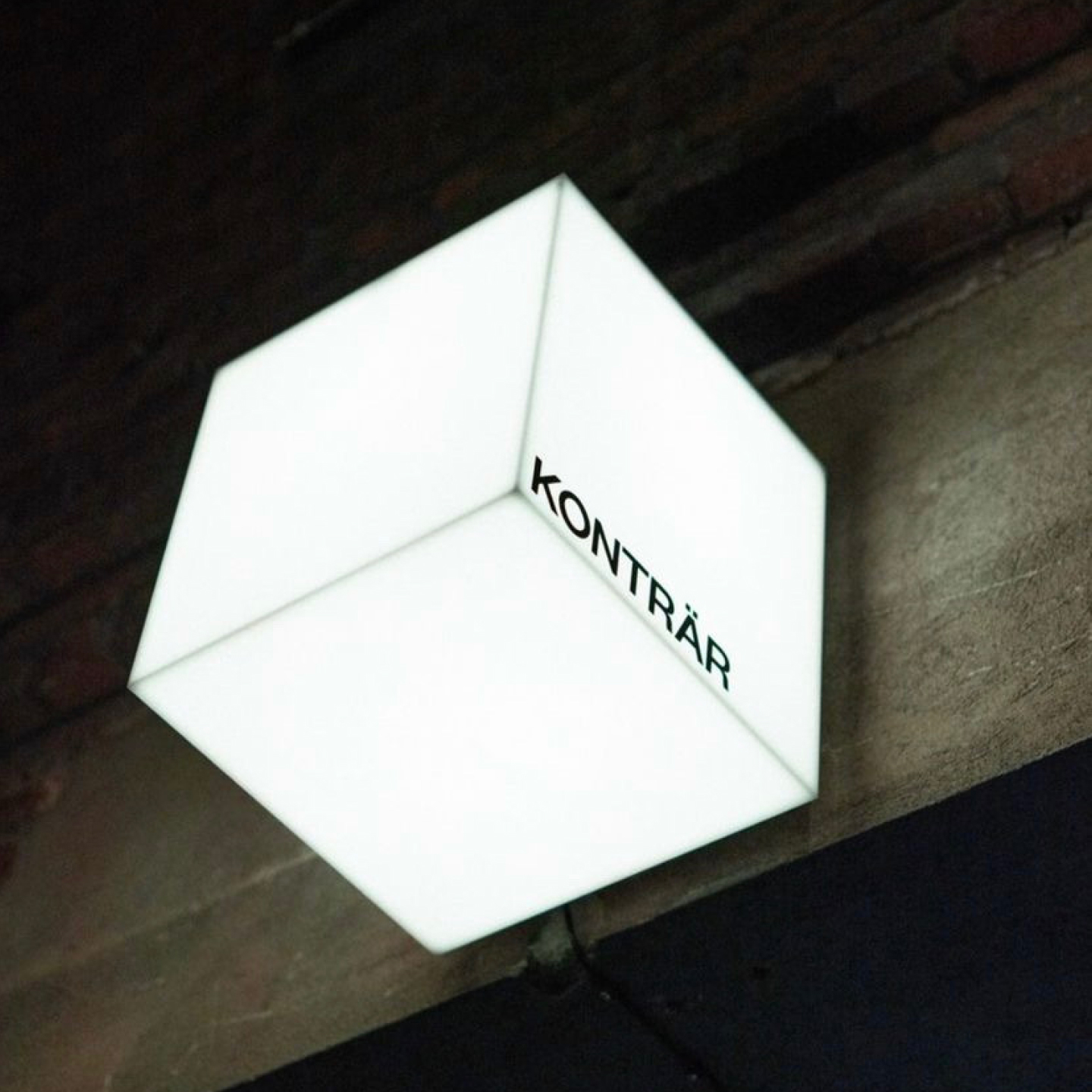
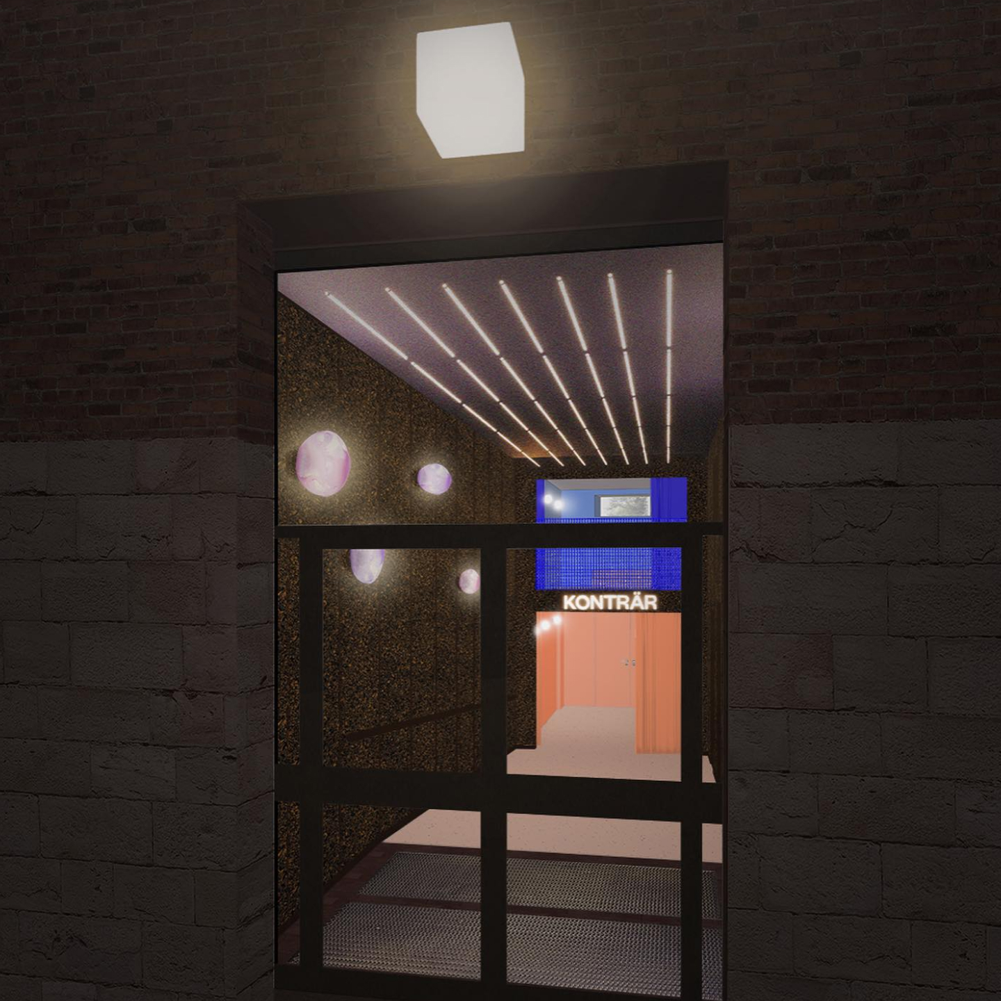
The main stage is often referred to as the ‘Black Box’. This multipurpose room is where everything happens, naturally becoming a symbol for the brand.
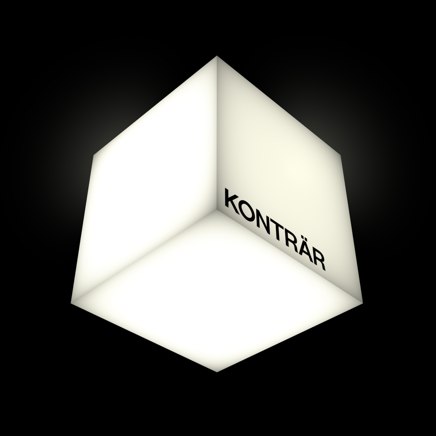
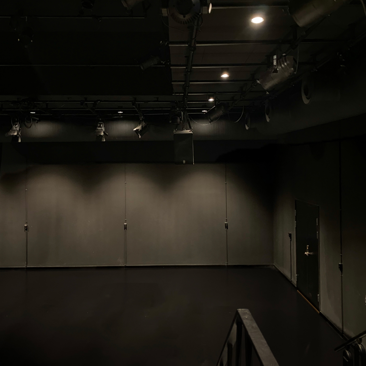
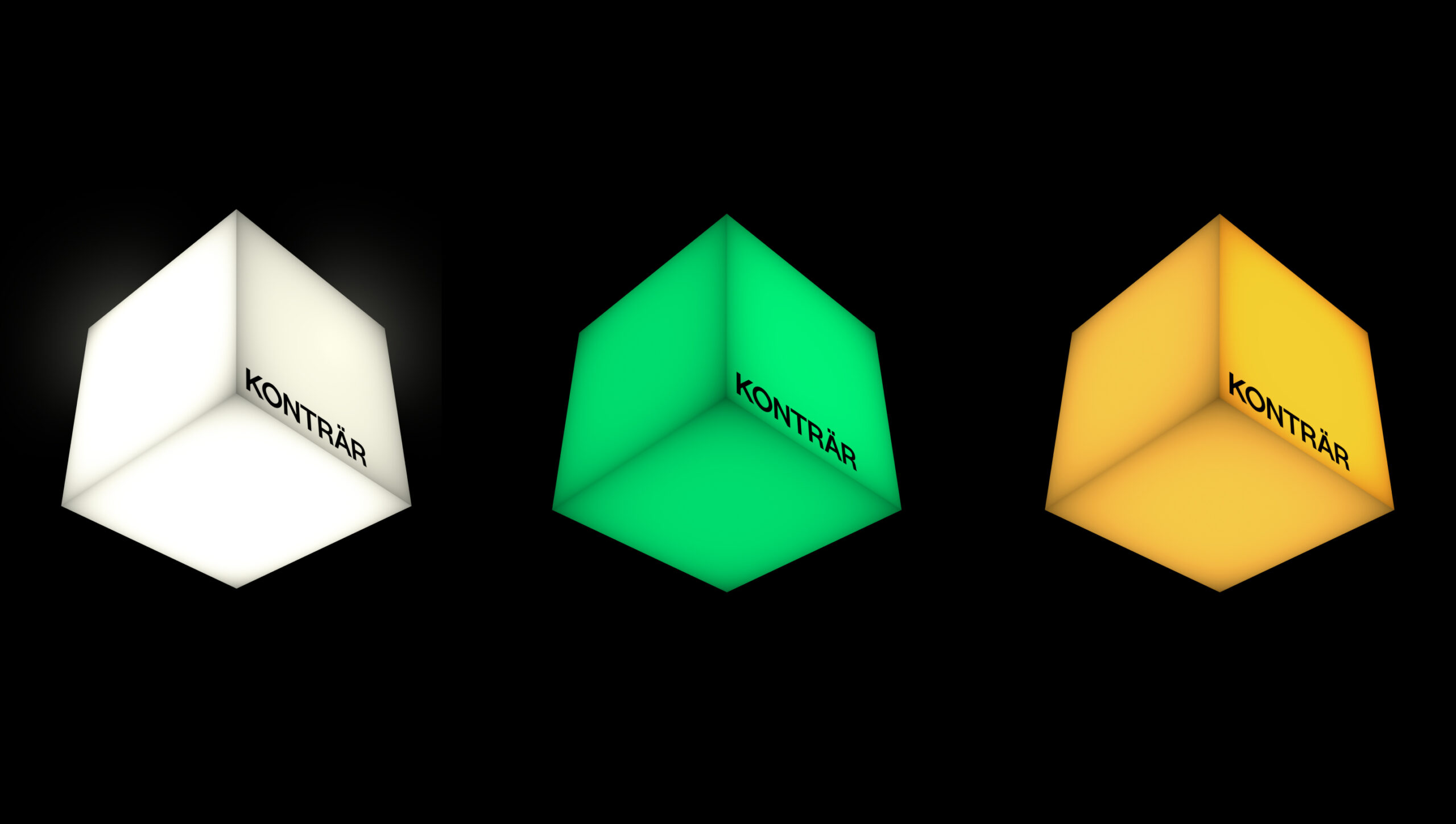
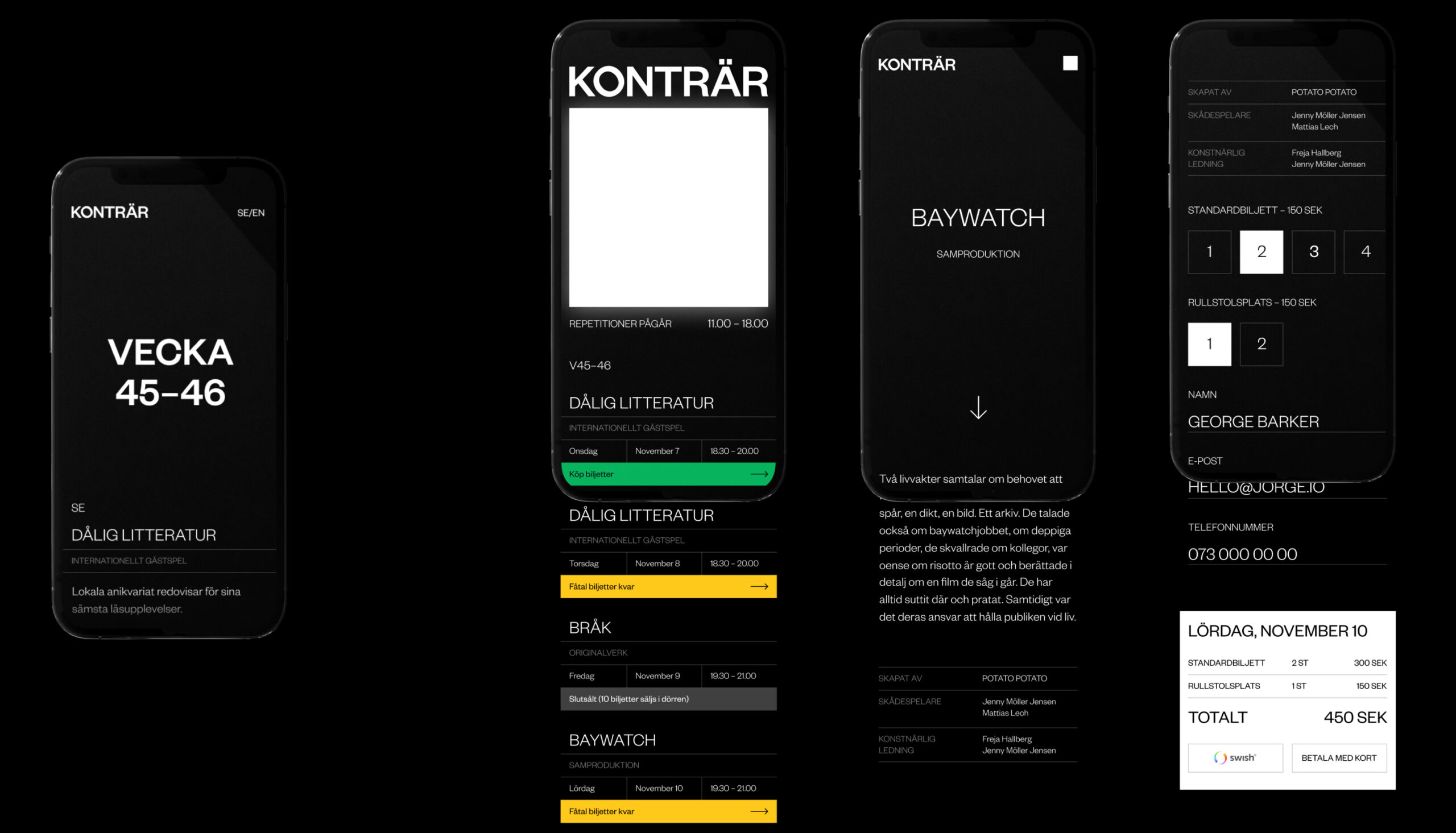
The cube switches colour for different states of the venue. This live interaction is also synced with the website. With the simple three coloured states we aim to create a pattern of recognition for Konträr’s audience.
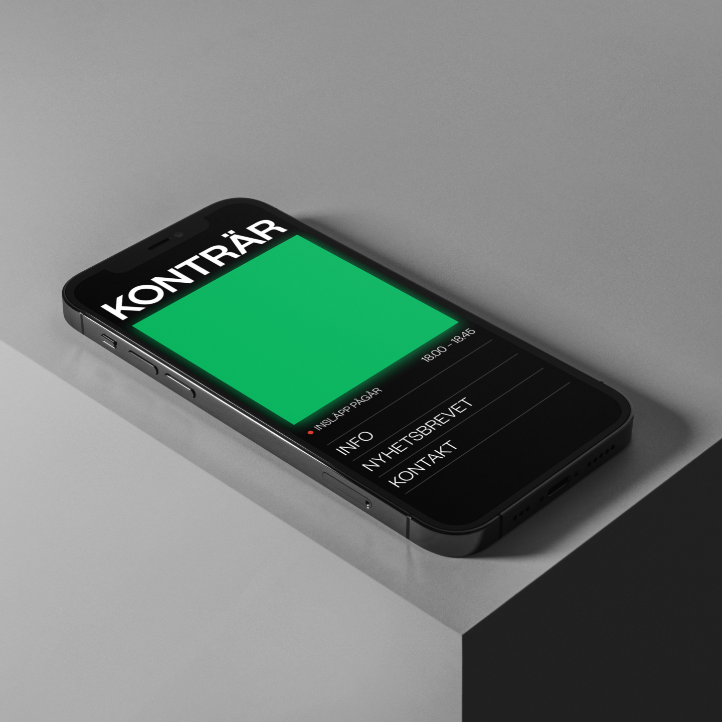
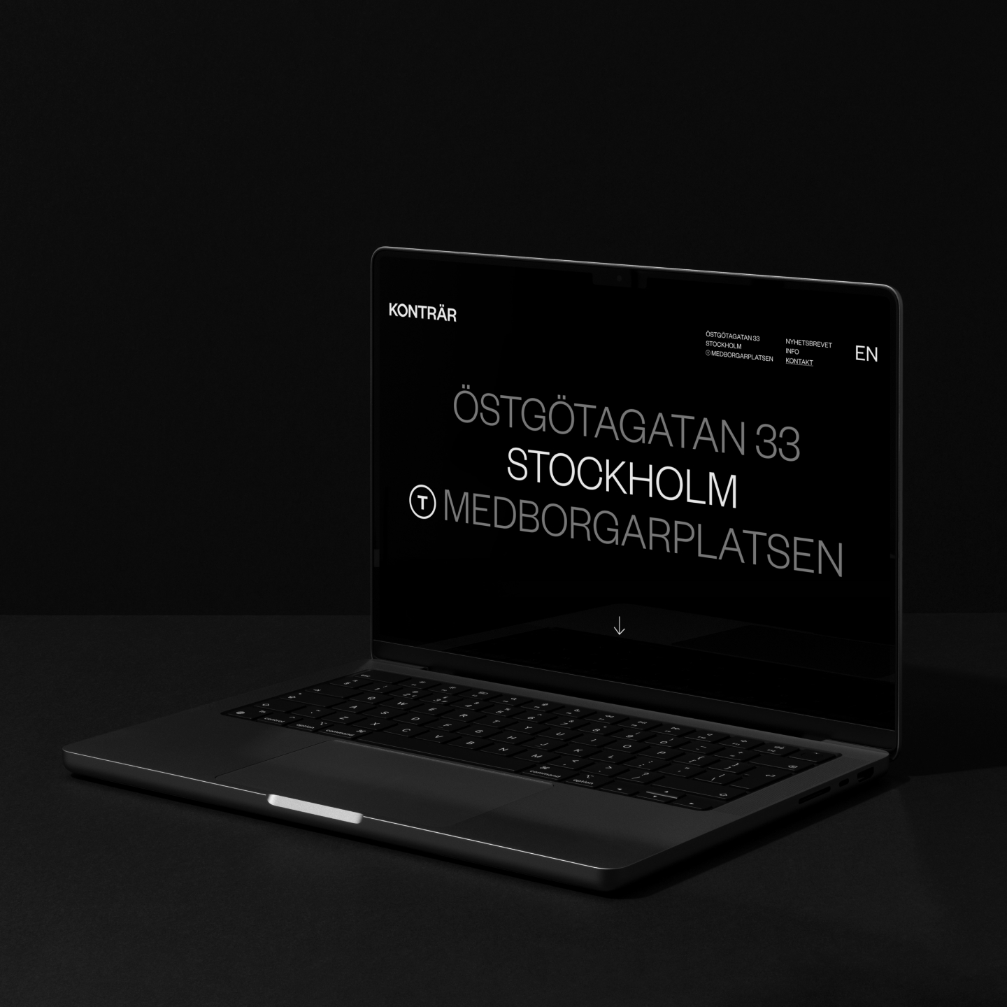
The website is built up on two different platforms. One site that is easily accessible for new and intrigued customers. And the other one linked through the weekly newsletter to buy tickets.
contact@ochgreta.com
@studio.greta
