NEEN
Nordic Energy Equality Network (NEEN) is a network within the energy sector who work to improve gender balance and promote diversity in energy-related matters in the Nordic and Baltic societies.
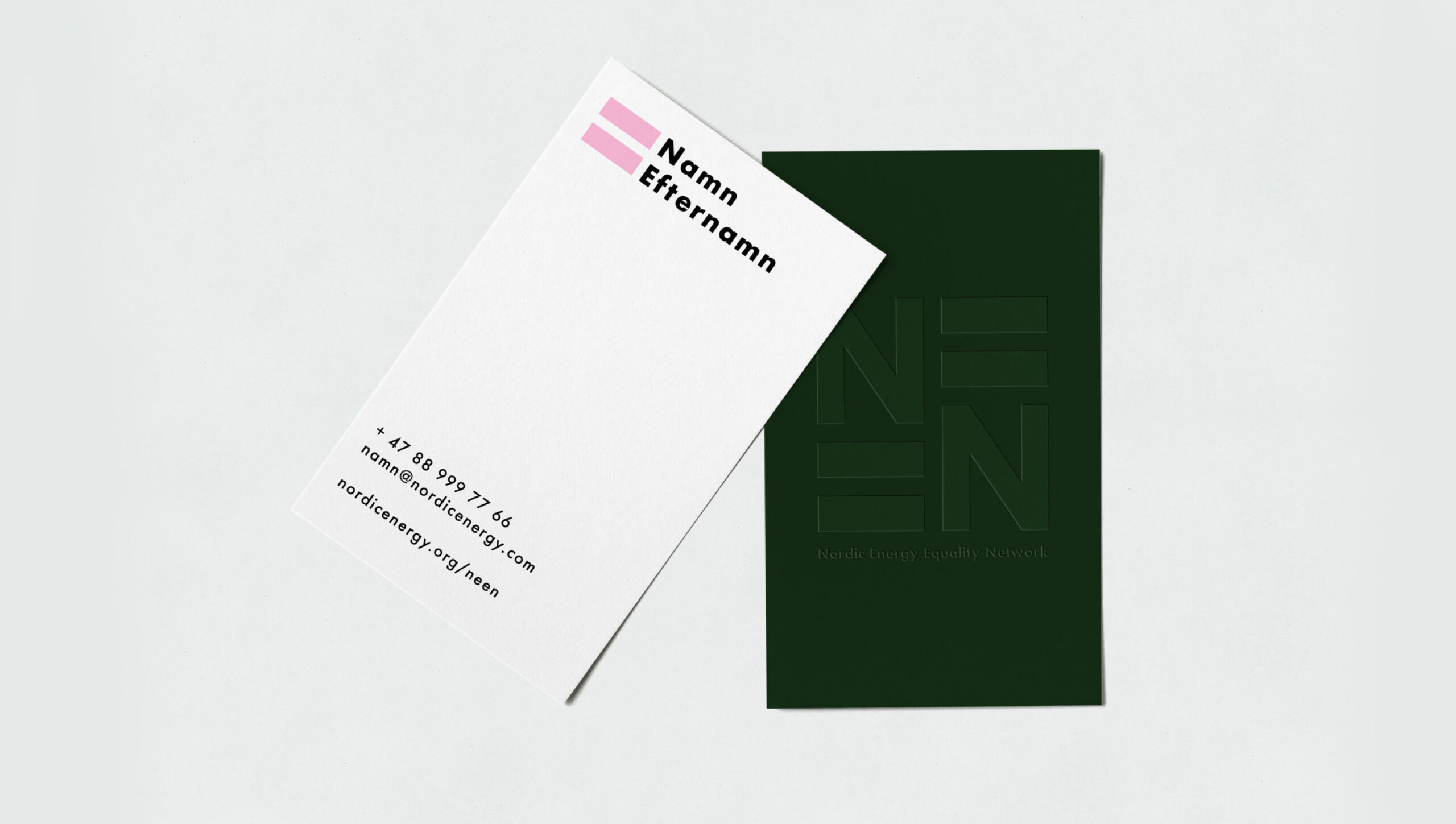
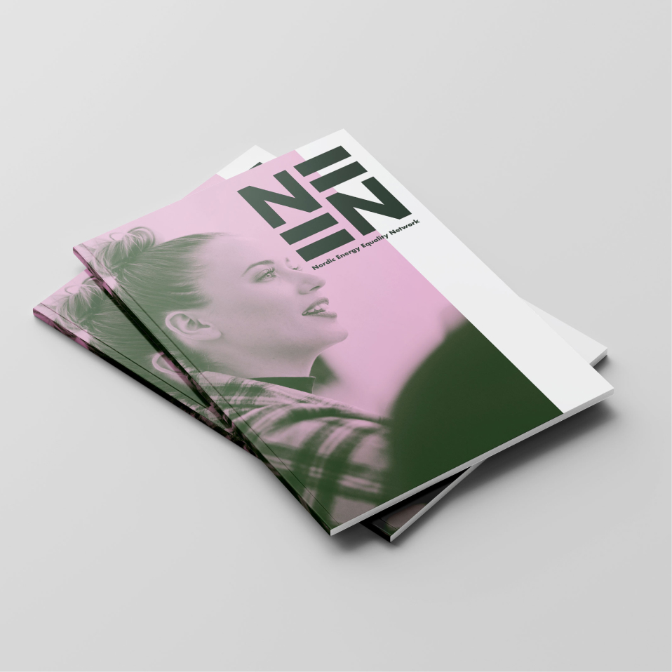
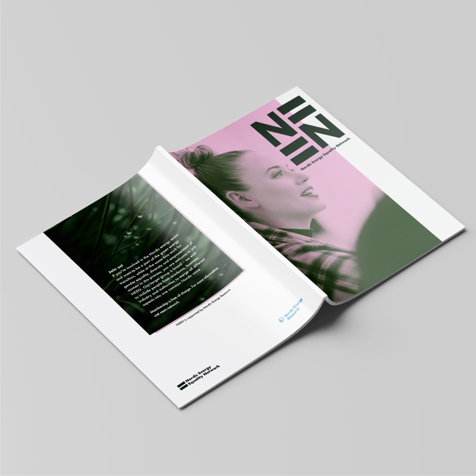
Creating a brand identity that integrates the network’s core values: equality, acceptance, positivity and strength. The ”equal” sign conveys a lot of symbolism for these values. Using this symbol we replaced the E’s in the name to create a simple, uncluttered and strong logo for the network.
Client
Nordic Energy Equality Network
Project type
Branding Design
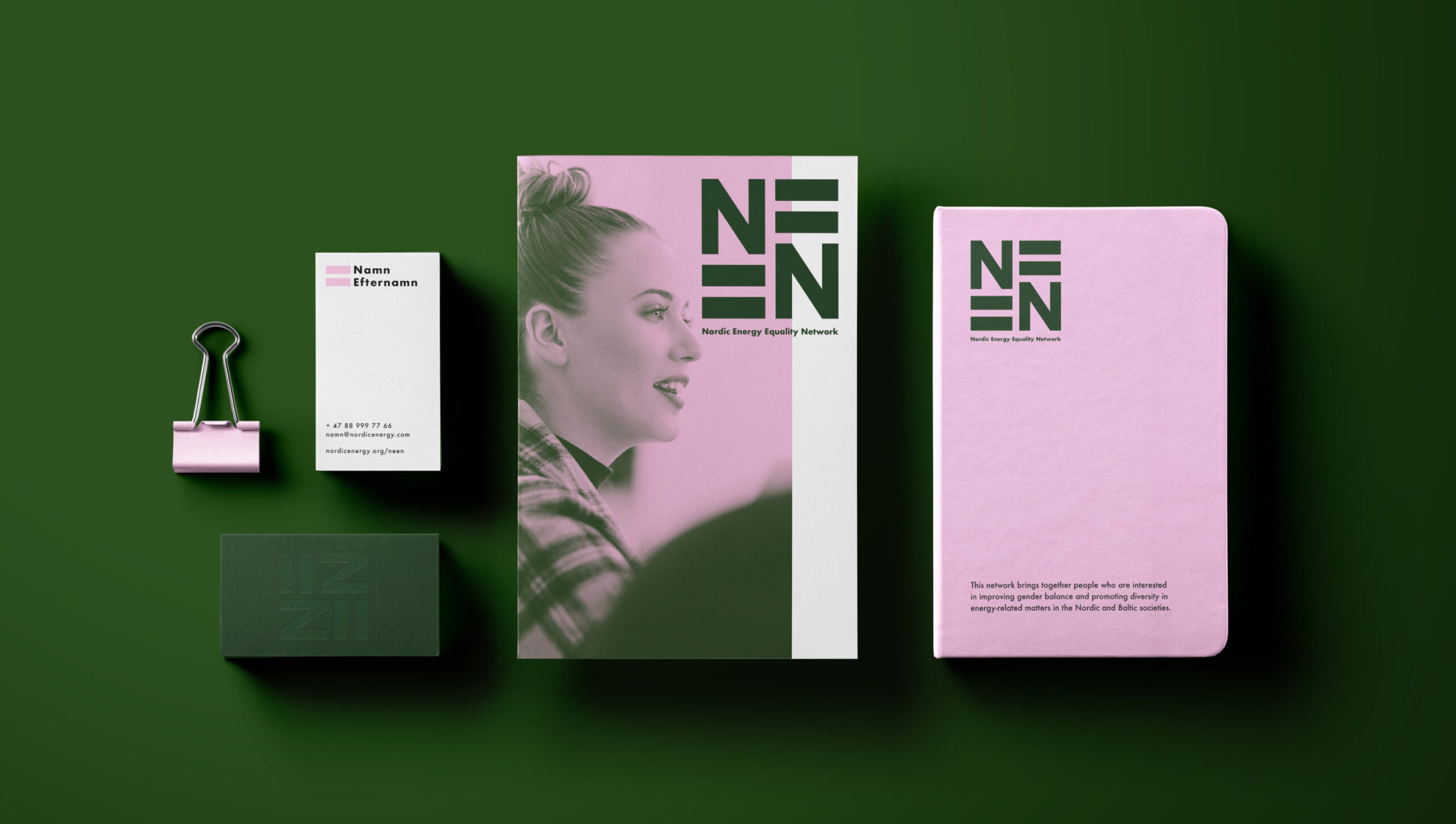
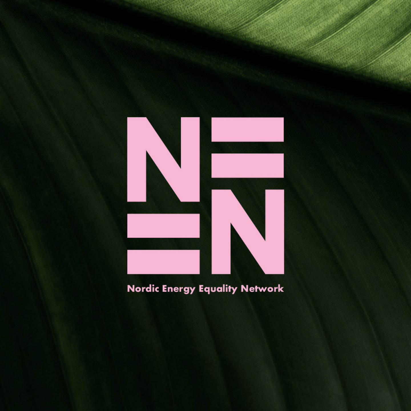
The colour palette uses a modern take of sustainability with the presence of female power.

contact@ochgreta.com
@studio.greta